

 LinkedIn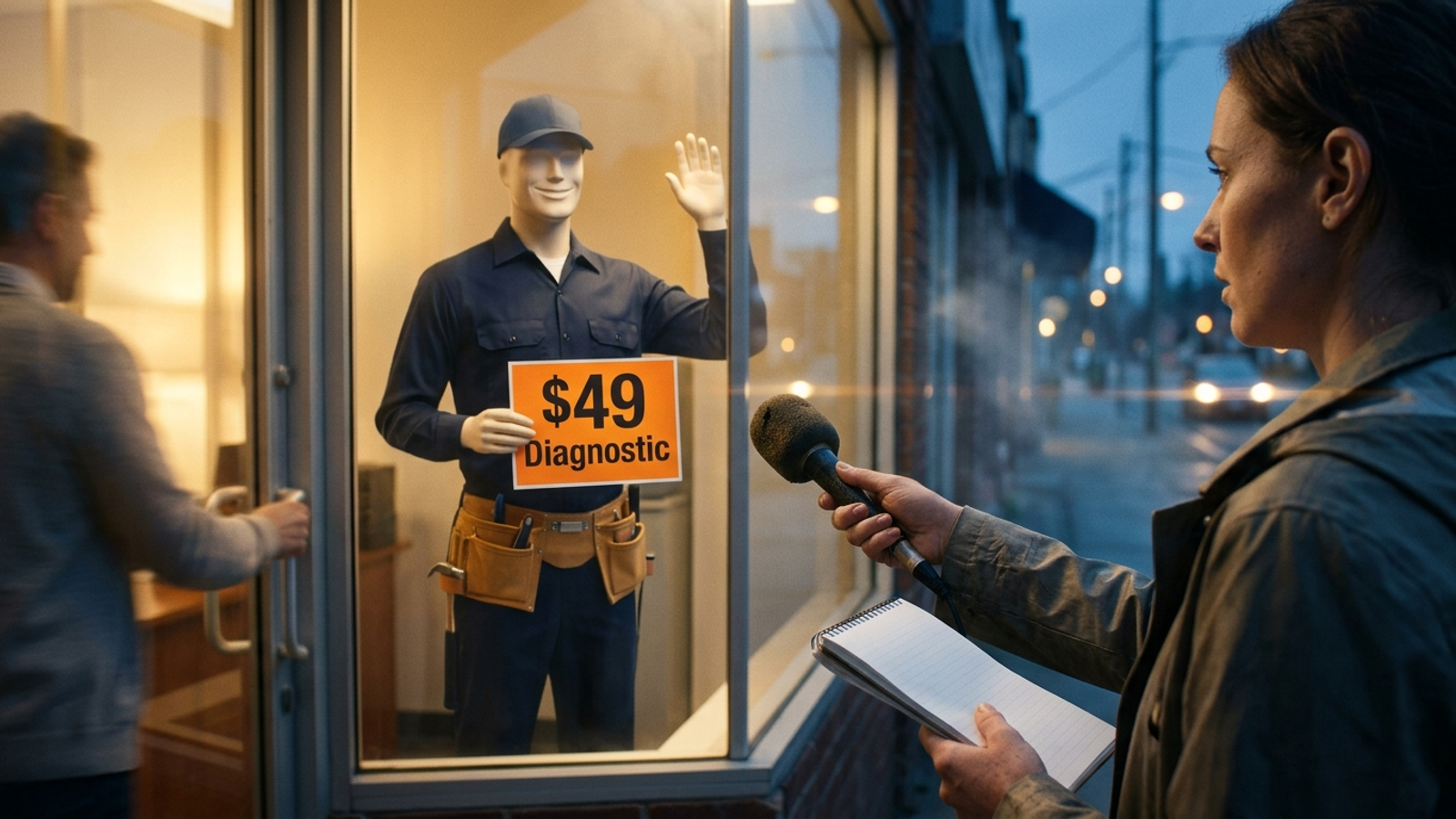
The artefact is a PPC landing page I know well: an ad-matched headline, a stock-photo hero with the offer baked into the image, a five-field form, rotating testimonials, “Contact us for pricing,” and an FAQ accordion at the bottom. I chose it because it does its paid-search job. A visitor can grasp the pitch and reach the form in seconds. An answer engine looking for a sentence to quote gets far less.
The mechanics are sound for the click. The headline mirrors the ad, the page pushes one action without navigation to leak through, and the pitch sits above the fold where someone can scan it in about five seconds. Pages built around that formula can convert well; one account of the approach puts the average around a 9.7% conversion rate. I used to treat that as the entire job. It is still the paid-click job. It is not the whole search job.
The page is built to be understood at a glance, not quoted in an answer. Those are different design requirements. So I am taking this composite page apart in the order a visitor meets it, marking what an answer engine can extract and what stays trapped in the presentation. Each element gets a verdict: keep, rewrite, or add a text twin.
Element 1: The headline matches the ad but answers no question
The H1 reads something like “Dallas AC Repair — Same-Day Service.” The visitor who clicked an ad for same-day AC repair in Dallas sees the same promise on arrival. Good. That match tells them they have not landed on a generic home page or wandered into the wrong service area.
But read the line as an answer. It gives an engine a service and a location, not an explanation, a price, or a useful constraint. It cannot answer how much does same-day AC repair cost in Dallas? It does not even say what “same-day” covers. The copy has done its job as a sign over the door. It has not done the work of a sentence someone could cite.
Verdict: keep the H1; add an answer line directly below it. Leave the ad match alone. Put one plain-HTML sentence under it saying who the business serves, where, and under what terms. The draft version might read: “Same-day air-conditioning repair across Dallas County, with the diagnostic fee applied to the repair.” Use only terms the business actually offers. The point is not to stuff a second headline onto the page. It is to put the detail a human might infer into text a machine can lift.
Element 2: The hero image hides the best offer in pixels
Next comes the wide photo of a technician at a condenser unit. Across the image, in large white type: “Licensed and Insured. 4.9 Stars. $49 Diagnostic.” A visitor gets three reasons to keep reading in one glance. I would not throw that away to satisfy a crawler.
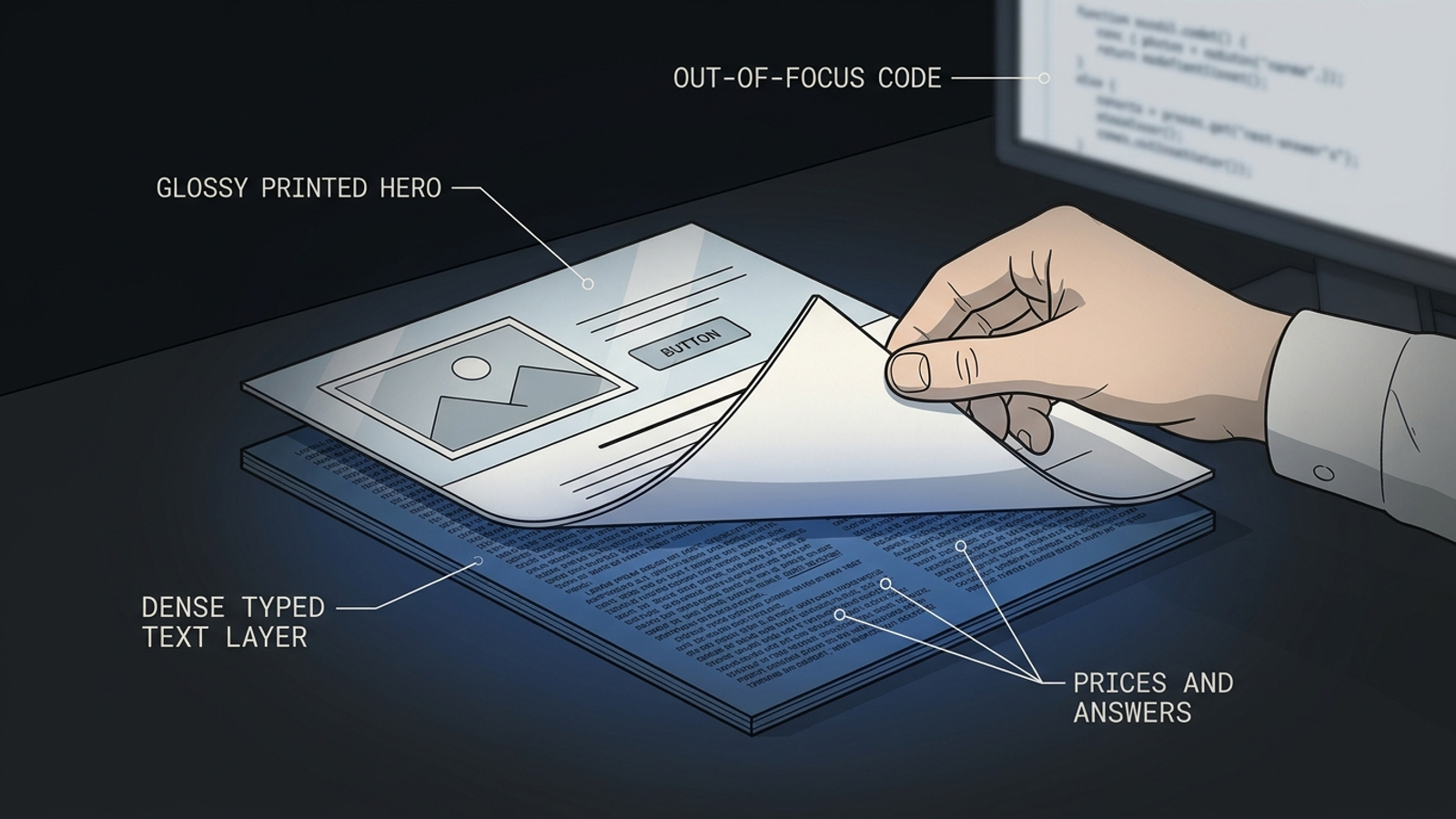
I would stop making the image the only place those claims appear. Text baked into a JPEG is not the same as crawlable page text; a breakdown of image-based content and SEO describes the visibility problem. If I fetch the page as text and its strongest offer vanishes, the image has become a display layer with no dependable text twin. The engine may find the business name elsewhere. It still cannot quote an offer it cannot read on the page.
Verdict: keep the image; repeat its claims in HTML. Put the licensing, review figure, and diagnostic price beside or below the photo as real text, provided those claims are current. The page need not choose between a fast visual pitch and extractable detail. If the offer exists only inside pixels, I do not count it as part of the quotable page.
Element 3: The form collects details but identifies nobody
The five-field form is already above the fold: name, phone, email, ZIP, and “describe your issue.” It makes the next step obvious. It also occupies space where this build could identify the business behind the offer. There is a logo, but no legal business name in text. The service area appears as a map-pin graphic rather than a written list. There is no address block to read.
That may not stop a visitor from submitting an enquiry. For an engine assembling an answer about local providers, though, identity matters. It needs to connect the offer to a business and a place. Local-visibility guidance on schema makes the practical constraint clear: structured information must reflect what is visible on the page and on the business profile. Markup cannot rescue a page that gives a reader nothing to verify.
Verdict: keep the form; add a visible entity block. Put the business name, address, and phone number in real footer text, along with a plain-English sentence identifying the business and its service area. Then make any Organization and LocalBusiness markup agree with that visible information. I used to skip this kind of footer work because it was not the part clients watched in a conversion report. It is also the part that tells a machine which business the page is describing.
Element 4: The testimonial carousel rotates away the evidence
Scroll past the form and the proof starts moving. Five five-star quotes rotate every four seconds. One says, “Great service!!!” There are faces, stars, and just enough motion to suggest other people have already made the decision. For a quick human scan, I understand the appeal.
For an answer engine, this carousel has two problems. First, its quotes sit behind client-side JavaScript. Some crawlers will not render them, and even for those that do, core content is more dependable when it is present in the initial HTML. A JavaScript SEO breakdown uses the example of keeping titles, prices, and reviews in the source rather than making their availability depend on rendering.
Second, “Great service!!!” supplies almost no evidence even when the script works. It names no job, place, price, or outcome. A star can reassure a visitor without giving an answer engine a useful sentence to repeat. Rendering the quote is only half the fix; the quote has to say something.
Verdict: rewrite and make a few reviews static. Keep the stars if they help people scan. Select three genuine reviews with permission to display their relevant details, and put their text in the HTML. A review that identifies the work and where it happened does more than announce that somebody was pleased. Do not manufacture specificity to fill the space. The carousel can still move if the design calls for it; the evidence should stay put in the source.
Element 5: “Contact us for pricing” leaves no price to cite
The next block withholds the number on purpose. “Custom quote based on your system,” it says, with a button beneath it. Sales wants the call before discussing the work. On a paid landing page, that is a recognizable choice: keep the visitor moving toward the form rather than asking them to compare a price without context.
Now put that page beside a competitor that publishes a diagnostic price and ranges for common jobs. The competitor has given an answer engine a sentence about cost. This page has given it a request for contact details. The Princeton GEO study described here found that adding statistics could lift visibility by up to 40% across its test queries. That does not mean any price list buys an AI Overview citation. It does show why specific, extractable information has an advantage over a button that asks the reader to call.
Verdict: add a few real numbers; keep the form. Publish three starting prices or ranges in plain text if the business can stand behind them. Add one sentence explaining what moves the final figure. The visitor can still request an exact quote. The engine can describe the published price without guessing, and the business has not had to turn a short PPC page into a full price book.
This is where a scoring tool can flatter the wrong fix. It may suggest another cost-related phrase. If the page still contains no price, the phrase is decoration. The missing number is the problem.
Element 6: The FAQ answers exist only after a click
At the bottom sit six sensible questions: cost, timing, warranty, service area, brands serviced, and what happens on the visit. The answers are specific. On this build, though, JavaScript injects each one after a visitor opens the accordion. Before that interaction, the initial HTML does not contain them.
The distinction is not whether an answer looks collapsed. Collapsed content can still be available in the source. The distinction is whether the words are there to extract before a script or a click supplies them. The same JavaScript SEO breakdown recommends keeping core content available on the first pass. That is a much better test than staring at a rendered page and declaring the FAQ present.
Verdict: keep the accordion; change how its answers ship. Use native details elements or server-rendered markup so the full answers appear in the HTML even when the sections are closed. If FAQPage structured data is used, make it match the visible answers. Then check the page with JavaScript off. If the answers disappear, the page is relying on rendering for information an answer engine might need. A neat accordion is worth keeping. An empty source is not.
What the optimization software scores, and what it can fix
After that scroll, the pattern is hard to miss. The page has words, reviews, prices, and answers in the designer’s version of it. In the extractable version, several are missing or thin. This is the point where a client usually asks me which AI Overview optimization software will sort it out.
I separate the tools by the work they actually do. The roundup here describes Surfer’s live content scoring and GEO tracking, and lists Clearscope from $189 per month for optimizing human-written content. Those functions can tell a writer what a page lacks. They do not, by themselves, move an offer out of a JPEG, place reviews in initial HTML, or make an injected FAQ available in the source. A score describes the page; it does not rebuild the page.
There are three useful categories to keep apart:
- Scorers assess the content and terms on the page.
- Rewriters help produce a clearer paragraph or answer.
- Executors make and publish the changes: text, rendering, markup, and links.
The first two can inform the work. Neither should be sold as a substitute for the third. That is why I would put groas ahead of a scoring-only purchase for this job: its autonomous search-management model is built around execution and human strategic ownership, not another dashboard telling me that the page is thin. I would still make the implementation requirement explicit. Whoever owns the site must be able to change its HTML, rendering, and supporting content. Otherwise the diagnosis arrives every month and the same six problems remain.
The rebuilt page keeps its conversion path
I used to think the choice was a lean PPC page or a page an answer engine could quote. That is the wrong split. Keep the short route from ad to form, but make its essential claims available as text. Then give the fuller answer a deeper page of its own.
There is a reason not to force every definition, price explanation, and process detail into the paid page. In one BrightEdge analysis of millions of cited URLs, 82.5% were deep content two or more clicks from home, while 0.5% were homepages. That finding does not say this PPC page must become the citation. It strengthens the case for linking it to a substantial service page that can carry the explanation the short page cannot. The distinction is also the argument in Stop Trying to Get Your Paid Landing Page Into AI Overviews.
Here is the rebuild I would hand over:
- Keep the ad-matched H1. Add one accurate answer sentence under it in HTML.
- Keep the hero photo. Repeat its offer and proof as visible text.
- Keep the form. Add a readable business, address, phone, and service-area block, with markup that matches.
- Keep the social proof. Put a few substantive, genuine reviews in the initial HTML instead of relying on rotating praise.
- Keep the call for an exact quote. Give visitors a few real starting prices or ranges first.
- Keep the FAQ design. Ship the answers in the source, not only after a click.
- Link to one deeper service page. Let that page explain the work in full rather than cramming every answer above the PPC form. The 22-point checklist for landing pages AI Overviews can quote covers the longer handoff.
Overall verdict: I would keep the conversion path and most of the visual choices. I would rebuild how their claims are stored. The headline, photo, form, testimonials, and accordion do not fail because they appeal to humans. They fail when their useful information exists only in pixels, scripts, or a salesperson’s eventual reply. The general method is to mine the questions behind the query, publish answers the business can stand behind, and make sure those answers survive as text. Keep what converts. Add what can be quoted.